Research
 This title is similar to the one I'm going to do, I'm choosing a simple title which will stand out on the side with a quirky font. This doesn't stick to the usual conventions of a music magazine where the titles are usually a simple bold font. My main headline isn't going to go across the whole page because I don't want to over power the picture with such a bold headline. I could have my title as Solo Music Distribution but I think it would look better if I just had SMD on the cover, with the full name underneath in a small font, which is similar to NME where they have New Musical Express underneath. Most magazines don't change the colour of the title unless there is a special edition, however my magazine is going to change the colour depending on the colour scheme used in each front cover. For example it wouldn't look good if it was pink (lets say) all the time and the model had clashing colours on and were male.
 This title is similar to the one I'm going to do, I'm choosing a simple title which will stand out on the side with a quirky font. This doesn't stick to the usual conventions of a music magazine where the titles are usually a simple bold font. My main headline isn't going to go across the whole page because I don't want to over power the picture with such a bold headline. I could have my title as Solo Music Distribution but I think it would look better if I just had SMD on the cover, with the full name underneath in a small font, which is similar to NME where they have New Musical Express underneath. Most magazines don't change the colour of the title unless there is a special edition, however my magazine is going to change the colour depending on the colour scheme used in each front cover. For example it wouldn't look good if it was pink (lets say) all the time and the model had clashing colours on and were male.
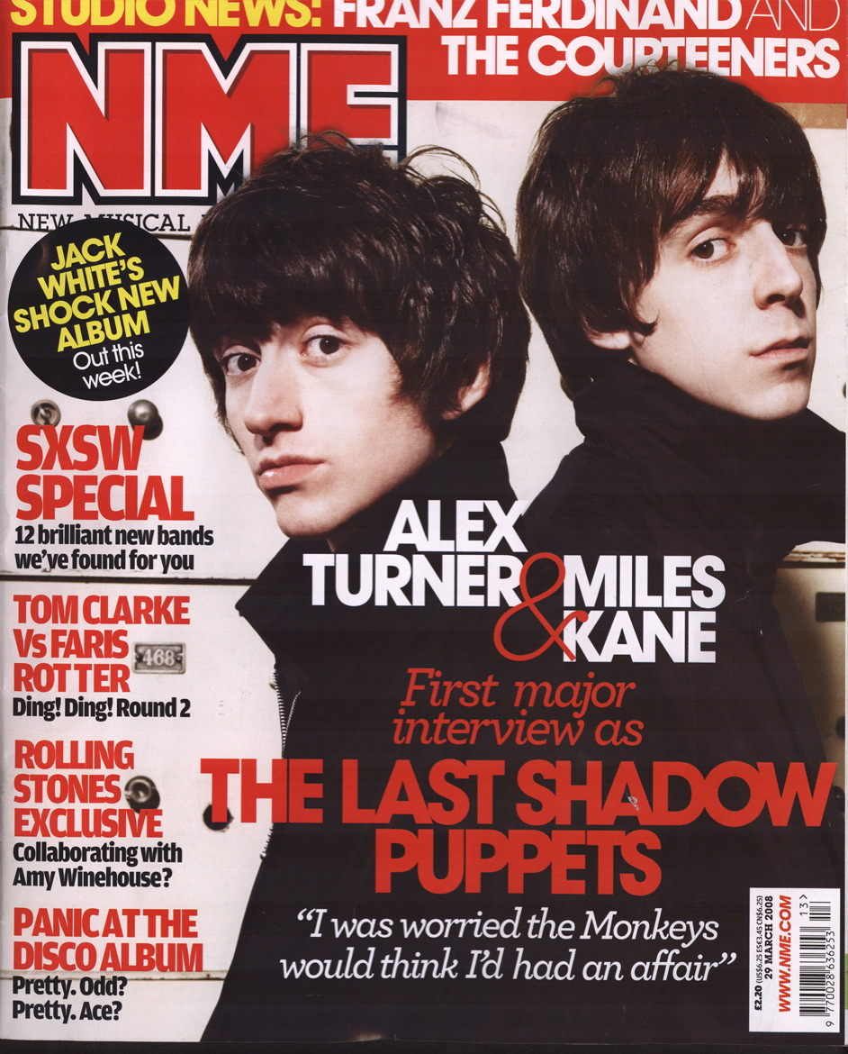
No comments:
Post a Comment