
This front cover of NME keeps to the codes and conventions of music magazines.
The image of Noel is the largest thing on the page, and the headline which is about him is the biggest piece of text on the page because this draws your eye in and it's the first thing you see on the page. The cup and saucer are either side of the title "OASIS" as they are important to the theme they are conveying about Noel being very British, but still a thug, because of the play on words, "one thump or two?" which shows he's got a hard side to him although he is holding delicate crockery. Then there are other stories surrounding which have smaller text, and bold headlines to ensure they still stand out. Here all of the smaller sell lines have a different colour title and text underneath which is also a smaller font size. I'm going to use this in my magazine because it really makes sell lines stand out and uses a variety of text which is seen in all magazines.
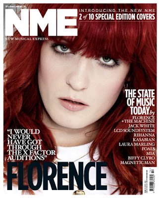
This cover looks more like the cover of Vogue magazine as it's a special edition, even the way she has been photographed (close up) adds to the style being similar to Vogue. Even though it's a special edition there is a still the clear colour scheme of red, white and black which matches with her hair, this gives a really crisp look to the front cover. There is a typical quote above her name, which gives the audience a personal view to what Florence is all about, it gives a curious feel, which makes the audience want to read on and discover what she is talking about, this type of sell line is used a lot because it creates curiosity inside the reader and they will always want to read on. There aren't many sell lines on this cover because it's the second special edition out of ten, so there is less need to give attractive sell lines about gossip and new releases because regular readers or collectors are going to buy them because it's limited edition.

This is an NME contents page, and it sticks to the codes and conventions. There is a picture which presumably relates to the headline on the cover, which is accompanied by some text and the number of the page, this is often used in magazines because it makes it really easy for the reader to find the article they wants to read. Under the central image is an offer to say money buy subscribing to the magazine, I'm using this in my magazine because it attracts regular readers and new readers and it actually shows a saving for the reader, and as people are always looking for a bargain this is an ideal way to attract an audience. Then on the right is the rest of the news for that weeks issue, which is headed by titles so it's easier for the reader to navigate to which section of the magazine they want to read, it's very clear on the page which readers will like because they don't have to spend more time trying to find what they want. There are also sub titles which create and even easier navigation around the magazine. On the right in a "band index" which gives band names and page numbers so readers can easily find information about their favourite band, this is really useful, especially in a music magazine because some readers will buy it just to read about their favourite band. There is a colour scheme of black, white and red, which works well because it makes it really simple to read because there aren't too many clashing or vibrant colours which can make magazines difficult to read, but this isn't usually found in music magazines, it's more likely to be in a celebrity gossip magazine.
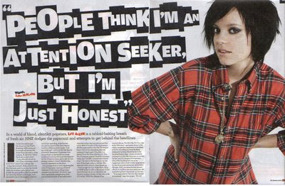
This double page spread looks good because there is just a simple image of the artist, Lily Allen and then are giant quote from the interview which has an loud attitude, which is similar to Lilys' personality, her pose shows a lot of attitude, not moody but quite in your face "look at me" It is set out like a ransom note with different sized text which gives an edgy rock feel even though she is a pop artist. The whole attitude oozes a tough man attitude, similar to a rebellious teenager which she was. There is a mixed vibe between a rocky wild child and a pop princess. In a sentence explaining the article above her name is in red bold text to make it stand out to anyone who doesn't yet know who she is.
The colours are usually associated with a rock magazine as well which add to the character of the page. The white background makes Lily stand out and draws the eye towards her. This also makes the headline stand out more because the background is so plain it allows everything else to stand out more. If it had bright colours it wouldn't make a statement in the same way.


