Monday, 11 April 2011

Evaluation: What have you learnt technologies from the process of making this?


I’ve used Publisher, Windows Live Photo Gallery, Photoshop, and Blogger.
I’ve used all of these before apart from Blogger, but it’s really easy to use to create good looking posts.
I had experience with Photoshop, but editing some of my images on here increased my knowledge of the technology and now I feel more comfortable using it that I did before.
Windows Live Photo Gallery is a programme on Windows 7 for simply editing photos, and this is what I used to initially change the brightness on my photo’s before using Photoshop.
Publisher is really simple to use and I’ve had loads of experience with it and it was a good technology to create my magazine with. 

Evaluation: What kind of media institution would distribute your product and why?


IPC media would distribute my product because they have products similar to mine and it means they wouldn’t be taking a massive risk to their company. But at the same time it’s a little bit edgy because of the alternative colour scheme used, and this would still attract a market that isn’t broad, but isn’t a niche market either.
 

Evaluation: How did you attract/address your audience?

I used some typical conventions of a music magazine which will attract my target audience because they are usual techniques that all magazines use. But I’ve also used a quirky colour scheme which will appeal to them because they are “indie”. I’ve used a male model because this will attract girls who might fancy him but boys too because they will aspire to be like him. He writes his own music and my target audience do this too so this will appeal to their personalities. Using my questionnaire I made the magazine suit what they wanted from a magazine, this works best because then you are making a product you know they will want to pick up and read.
I put attractive sell lines on the cover which will entice my audience to pick it up and buy it, this is done on all magazines but I’ve made my sell lines fit into something my audience would want to read.

Evaluation: How does your media product represent particular social groups?


My media product represents the social group I’ve chosen through the codes and conventions I’ve used and how I’ve also played against them to create a media product which will attract my target audience of 16 – 24 year olds with no specific gender.

The front cover is open and friendly, although my model isn't smiling he is portraying a strong silent type of male. There are several sell lines on the front, but not too many to over crowd his image, they are mainly on the left which evens out the image and the sell lines, and gives the page structure. There are also some band names at the bottom which give a border to the page and this adds to the cover content. The male model used on the front cover will attract females and males because males could aspire to be like him. But also colours are becoming less attached to gender as we move on because times are changing. The title is quirky and doesn't stick to the usual conventions of a music magazine, but this can attract my audience because it’s individual.                                                                                                                                                                                                                                                                                                                                                                                                                                                                                                                                                                                                                                                                                                                                                                                                                                                           

This is my final front cover, I've made some dramatic changes because my initial cover wasn't good enough.
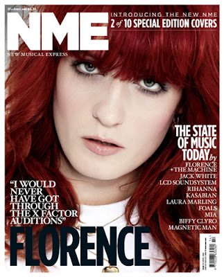
I've now got a variety of fonts and sizes on the cover because this is conventional of music magazines and it really does look better. I've also used a wider variety on colour this time because it makes it look more appealing to my target audience. I changed my model because I had more time to do a photo shoot with this model and a different place to work in.I've also used a different pose where he is looking just pas the camera. I added different bands and sell lines onto the cover because it looked dull before and now it's given the page a different look. I've also changed my colour scheme because the light blue would appeal to a wider target audience. The purple I chose before would stereotypically just appeal to girls, but as I want to appeal to men too I've changed it to a light blue. The title has now changed to a different font which is far more appealing and interesting to the reader because it isn't as bland. There are still some band names at the bottom, but now they aren't my only sell lines they are just extra artists who're featured in the magazine. 

 My second contents page is very different, although I've kept some of the images on the page because they were still acceptable to go on the page. The contents title has gone and has been replaced with the SMD design and "this week" which looks so much better because it's more interesting to look at. There is also much more structure on the page, I did this by centralising the titles for the pages and this means it's easier to find. I've also reduced the size of the editors letter to make it smaller, as some people don't even read it and it means there is more space for other articles or images which people are more interested in. 
My subscription section looks really good, I've created small versions of the "previous" covers and put them together, I got this idea from another magazine I researched, and I think it looks really good. It's also in a black text box which really makes it stand out. There is an image of my model on the inside with some text underneath about him, this is often used in magazines and I think it looks really good in my magazine, and his name really stands out on the page. 

My second double page spread is so much better because I've used better images on the page which actually relate a photo shoot that I've done with the model. I've changed some of the text to relate to my artist because before some of the answers didn't relate to his gender, but the questions are still very similar. The colour scheme is really bright and makes my artist appear happy because it's a happy colour. The title Jakob Bray does have a white section behind it, but this makes it stand out on the page better. The large image on the side with a collection of small images is quite conventional of a magazine and it works well in my magazine. There is a quote on the page which always makes readers think "oh what's that about" and entices the audience to read the magazine. 

Research continued


This front cover of NME keeps to the codes and conventions of music magazines.
The image of Noel is the largest thing on the page, and the headline which is about him is the biggest piece of text on the page because this draws your eye in and it's the first thing you see on the page. The cup and saucer are either side of the title "OASIS" as they are important to the theme they are conveying about Noel being very British, but still a thug, because of the play on words, "one thump or two?" which shows he's got a hard side to him although he is holding delicate crockery. Then there are other stories surrounding which have smaller text, and bold headlines to ensure they still stand out. Here all of the smaller sell lines have a different colour title and text underneath which is also a smaller font size. I'm going to use this in my magazine because it really makes sell lines stand out and uses a variety of text which is seen in all magazines.
This cover looks more like the cover of Vogue magazine as it's a special edition, even the way she has been photographed (close up) adds to the style being similar to Vogue. Even though it's a special edition there is a still the clear colour scheme of red, white and black which matches with her hair, this gives a really crisp look to the front cover. There is a typical quote above her name, which gives the audience a personal view to what Florence is all about, it gives a curious feel, which makes the audience want to read on and discover what she is talking about, this type of sell line is used a lot because it creates curiosity inside the reader and they will always want to read on. There aren't many sell lines on this cover because it's the second special edition out of ten, so there is less need to give attractive sell lines about gossip and new releases because regular readers or collectors are going to buy them because it's limited edition.
 
This is an NME contents page, and it sticks to the codes and conventions. There is a picture which presumably relates to the headline on the cover, which is accompanied by some text and the number of the page, this is often used in magazines because it makes it really easy for the reader to find the article they wants to read. Under the central image is an offer to say money buy subscribing to the magazine, I'm using this in my magazine because it attracts regular readers and new readers and it actually shows a saving for the reader, and as people are always looking for a bargain this is an ideal way to attract an audience.  Then on the right is the rest of the news for that weeks issue, which is headed by titles so it's easier for the reader to navigate to which section of the magazine they want to read, it's very clear on the page which readers will like because they don't have to spend more time trying to find what they want. There are also sub titles which create and even easier navigation around the magazine. On the right in a "band index" which gives band names and page numbers so readers can easily find information about their favourite band, this is really useful, especially in a music magazine because some readers will buy it just to read about their favourite band. There is a colour scheme of black, white and red, which works well because it makes it really simple to read because there aren't too many clashing or vibrant colours which can make magazines difficult to read, but this isn't usually found in music magazines, it's more likely to be in a celebrity gossip magazine.

This double page spread looks good because there is just a simple image of the artist, Lily Allen and then are giant quote from the interview which has an loud attitude, which is similar to Lilys' personality, her pose shows a lot of attitude, not moody but quite in your face "look at me"  It is set out like a ransom note with different sized text which gives an edgy rock feel even though she is a pop artist. The whole attitude oozes a tough man attitude, similar to a rebellious teenager which she was. There is a mixed vibe between a rocky wild child and a pop princess. In a sentence explaining the article above her name is in red bold text to make it stand out to anyone who doesn't yet know who she is.
The colours are usually associated with a rock magazine as well which add to the character of the page. The white background makes Lily stand out and draws the eye towards her. This also makes the headline stand out more because the background is so plain it allows everything else to stand out more. If it had bright colours it wouldn't make a statement in the same way. 


Friday, 1 April 2011