- Is there a song or artist you would like to cover?
- You got into music a young age, what inspired you to do so?
- What would you say has been the biggest challenge of your career so far?
- What advice, if any do you have for someone who is just starting out in the music industry?
- So what are your plans for the coming year?
- Can we expect you to release an album soon?
- Do you have any back stage secrets from your tour?
- Who has supported you throughout your career?
- Would you ever take a leave from music to start a family?
Friday, 1 April 2011
Interview
Here are some mock up questions that I might use in my magazine.
Photoshoot Choice
For my photoshoot, I had to choose a suitable place to take my pictures. I also had to consider several options:
Where? - The beach? The Woods? A Field?
When? - What time of day? Evening? Midday?
Who? - Male or Female model?
What? - What should I photograph them in?
Poses? - Which poses should I make them stand in?
I've decided to take the photographs in the woods, in the evening because there should be a still bright light, but the sunset should make the photos look really good.
I'm also going to choose a male model, this is because he will appeal to girls and boys will look up to him as a style icon.
I'm going choose fairly casual clothes, but they could be from a designer place, but the target audience wouldn't know. I'm also going to allow the model to choose poses that feel natural, but for some pictures I'm going to ask the model to stand in certain places because of the light or the setting.
Photoshoot

images from my photoshoot, I used Windows Live Photo Gallery to edit my photos.


 Here is evidence of me editing my photos, I changed the brightness in some photos because they weren't bright enough to use in the magazine, I also changed the contrast in some images to make the colours more vibrant.
 First Draft Music Magazine
If I could do it again...

My initial front cover didn't have very many sell lines which made it look empty and boring, which wouldn't attract my target audience or anyone else really. My model's pose went against the codes and conventions because she isn't showing her face, which wasn't right as magazines always show the face of the artist. Also the title in this is really plain and doesn't stand out against the background and make an impact like I wanted it to. The graded background doesn't really work well because although it fits in with the colour scheme, it does just make everything blend together in a really boring way. The sell lines that are just grouped together at the bottom don't have a very good impact either because they don't stand out to the reader, if it was on a magazine stand the bottom wouldn't show anyway, so it's really pointless having them at the bottom. Also there is little variety in text sizes or in font, which means it all looks very similar. To make it stand out more I need to rethink my ideas because this version isn't as good as it could be.
The initial contents page lacks anything exciting, although it does have some good points, such as a variety of images, it still isn't good enough. It lacks a real structure which makes it confusing to read, and the images are set onto the page but don't look as if they match the headlines. The title "contents" is in a dull font and only stands out because it's white, otherwise I would barely notice it. The image on the top right of the page is badly edited with too much black background so it looks quite odd if I'm honest. The editors letter takes up too much room on the page and so does the image. In most magazines it's quite small so it looks out of place and awkward. The subscription section at the bottom looks really silly because it's not in a box with colour and it doesn't actually stand out to the reader, so it doesn't emphasise the fact it's a good offer.
This double page spread is not good, the images along the side are awfully edited which really brings down the look of the page and they don't really relate to the captions with them. The title is very blurry which makes it look really bad, and how the background is still around it also makes it look bad. I'm not sure on the background colour of the 2 pages being different, I can't decide if it looks unique or just rubbish, but when I do it again I think this will be changed. The overall colour scheme of the page doesn't really fit and now I think I'm going to be changing it because it's actually quite dark on the page and brings down the idea that my model is bright, bubbly girl who's really enjoying music, it would be suited to a metal band or something heavier. It doesn't represent my target audience well because it doesn't really show what they're into - and this is just through the colour scheme.
Research continued

This front cover of NME keeps to the codes and conventions of music magazines.
The image of Noel is the largest thing on the page, and the headline which is about him is the biggest piece of text on the page because this draws your eye in and it's the first thing you see on the page. The cup and saucer are either side of the title "OASIS" as they are important to the theme they are conveying about Noel being very British, but still a thug, because of the play on words, "one thump or two?" which shows he's got a hard side to him although he is holding delicate crockery. Then there are other stories surrounding which have smaller text, and bold headlines to ensure they still stand out. Here all of the smaller sell lines have a different colour title and text underneath which is also a smaller font size. I'm going to use this in my magazine because it really makes sell lines stand out and uses a variety of text which is seen in all magazines.
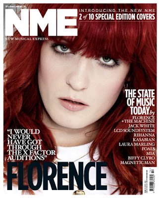
This cover looks more like the cover of Vogue magazine as it's a special edition, even the way she has been photographed (close up) adds to the style being similar to Vogue. Even though it's a special edition there is a still the clear colour scheme of red, white and black which matches with her hair, this gives a really crisp look to the front cover. There is a typical quote above her name, which gives the audience a personal view to what Florence is all about, it gives a curious feel, which makes the audience want to read on and discover what she is talking about, this type of sell line is used a lot because it creates curiosity inside the reader and they will always want to read on. There aren't many sell lines on this cover because it's the second special edition out of ten, so there is less need to give attractive sell lines about gossip and new releases because regular readers or collectors are going to buy them because it's limited edition.

This is an NME contents page, and it sticks to the codes and conventions. There is a picture which presumably relates to the headline on the cover, which is accompanied by some text and the number of the page, this is often used in magazines because it makes it really easy for the reader to find the article they wants to read. Under the central image is an offer to say money buy subscribing to the magazine, I'm using this in my magazine because it attracts regular readers and new readers and it actually shows a saving for the reader, and as people are always looking for a bargain this is an ideal way to attract an audience. Then on the right is the rest of the news for that weeks issue, which is headed by titles so it's easier for the reader to navigate to which section of the magazine they want to read, it's very clear on the page which readers will like because they don't have to spend more time trying to find what they want. There are also sub titles which create and even easier navigation around the magazine. On the right in a "band index" which gives band names and page numbers so readers can easily find information about their favourite band, this is really useful, especially in a music magazine because some readers will buy it just to read about their favourite band. There is a colour scheme of black, white and red, which works well because it makes it really simple to read because there aren't too many clashing or vibrant colours which can make magazines difficult to read, but this isn't usually found in music magazines, it's more likely to be in a celebrity gossip magazine.
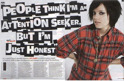
This double page spread looks good because there is just a simple image of the artist, Lily Allen and then are giant quote from the interview which has an loud attitude, which is similar to Lilys' personality, her pose shows a lot of attitude, not moody but quite in your face "look at me" It is set out like a ransom note with different sized text which gives an edgy rock feel even though she is a pop artist. The whole attitude oozes a tough man attitude, similar to a rebellious teenager which she was. There is a mixed vibe between a rocky wild child and a pop princess. In a sentence explaining the article above her name is in red bold text to make it stand out to anyone who doesn't yet know who she is.
The colours are usually associated with a rock magazine as well which add to the character of the page. The white background makes Lily stand out and draws the eye towards her. This also makes the headline stand out more because the background is so plain it allows everything else to stand out more. If it had bright colours it wouldn't make a statement in the same way.
Research
 This title is similar to the one I'm going to do, I'm choosing a simple title which will stand out on the side with a quirky font. This doesn't stick to the usual conventions of a music magazine where the titles are usually a simple bold font. My main headline isn't going to go across the whole page because I don't want to over power the picture with such a bold headline. I could have my title as Solo Music Distribution but I think it would look better if I just had SMD on the cover, with the full name underneath in a small font, which is similar to NME where they have New Musical Express underneath. Most magazines don't change the colour of the title unless there is a special edition, however my magazine is going to change the colour depending on the colour scheme used in each front cover. For example it wouldn't look good if it was pink (lets say) all the time and the model had clashing colours on and were male.
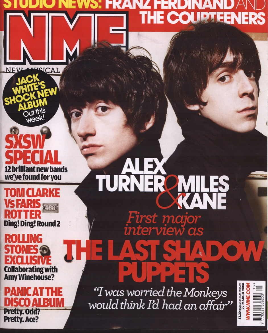
Questionnaire Analysis
This is my music questionnaire analysis, the data is collected from my questionnaire which I handed out to people who were my target audience. This way I would only collect data suitable for my music product.
I'm actually going to call my music product "SMD" - solo music distribution and specialise in solo artists in the indie genre because I feel sometimes they don't get enough recognition by larger magazine companies, but they don't put them on the cover because they only want established artists to be on their covers.
I'm actually going to use a purple theme for my magazine because it relates to my artist who is going to be female, although this wasn't in the questionnaire and it's not in my feedback, it still suits the codes and conventions of the magazine therefore it will still work.
1. What would you call a new music magazine aimed at people with an interest in pop/indie music?
Chordal, SMD, C.D collection, Music Madness, Skinny Jeans, Music! Pop Music Magazine.
2. What colour scheme would you like to see throughout the magazine?
3 Red, black, and white 7 blue, grey, and white 0 red, yellow and orange
3. What style of article would you like to read? E.g. formal or informal
8 informal 2 formal
4. Would you like the magazine to be glossy or non glossy?
3 non-glossy 7 glossy
5. What type of articles attract your attention?
Football, and bad things about celebs.
Funny ones
Reviews
Band profiles
Articles on fashion, new music and new films
Interviews and reviews
Music reviews and gigs
Informative
Humorous
Reviews on really good bands
6. Do you read the editorial? If not what would make you read it?
No, lots of images
No, if it was interesting
No, something personal
Yes, humour
No, nothing
No I wouldn’t ever
No, nothing would
No idea what it is
No, I don’t know what it is
Yes.
7. What types of image would you like to see in the magazine? E.g. full page, thumbnails etc
Half page, text surrounding images
Full page
Half page
Full page, thumbnails
Full page, thumbnails, filmstrips
Full page
Full page images
Full page
Full page
8. What style or font would you prefer the mast head like to be?
Bold and Big
Clear
Big, catches your eye
Smart. Easy-to-read, but not boring
Something frivolous
Clear, large, bold
Clear font large
Times? Bold
Big bold straight edge
9. How often would you like it to be produced?
Once a week
Weekly
Once a month
Monthly
Monthly
Every other week
Fortnightly
Every month
Weekly
Weekly
10. Would you like promotional offers and freebies to be featured? If yes please specify.
Offers for places such as HMV
Vouchers, well known high street shops and posters
Yes, tickets discounts and free band t shirts and mugs
Yes giftcards
Demo C.D.
Yes, promotional offer, freebies, notebooks, pens, earphones
Yes, t-shirts
Yes, free C.D.’s t-shirts, flip flops
Yes, free iTunes voucher
Yes, gig tickets discounts
11. What sort of adverts would you like to see in the magazine?
T.V. and music related
Cool ones.
Adverts for new films, albums
Nice looking men, clothes
Hot men in bands and clothes
Charity ads
Television series or films
Television or music
About upcoming gigs and concerts
Upcoming concerts and music events
12. Would you like other aspects of the media such as the internet or television to be included in the magazines content?
Yes.
No
T.V. maybe, internet no, other no
Yes
Yeah
T.V. programmes
Yes
Yes
No
Depends how
yes
13. Can you give 3 key words you would expect to see on the cover of an indie/pop based music magazine?
New, cool
Rad, music!
Music, indie, pop
New, album, band
Images, articles,
Music, guitar,listen
Original HIP, Justin beiber
I don’t know
Bands, charts, singles
Indie = Florence
Pop = Justin Beiber, JLS, wow.
14. What style of article would you like to see? E.g. reviews, interviews or gossip.
Interviews or reviews
Reviews and gossip
Reviews, interviews, stories
Reviews, interviews
Reviews interviews
Reviews
Interviews, reviews
Interviews
Gossip, informal interviews
Reviews and interviews and gossip
Subscribe to:
Posts (Atom)