Friday, 1 April 2011

Research

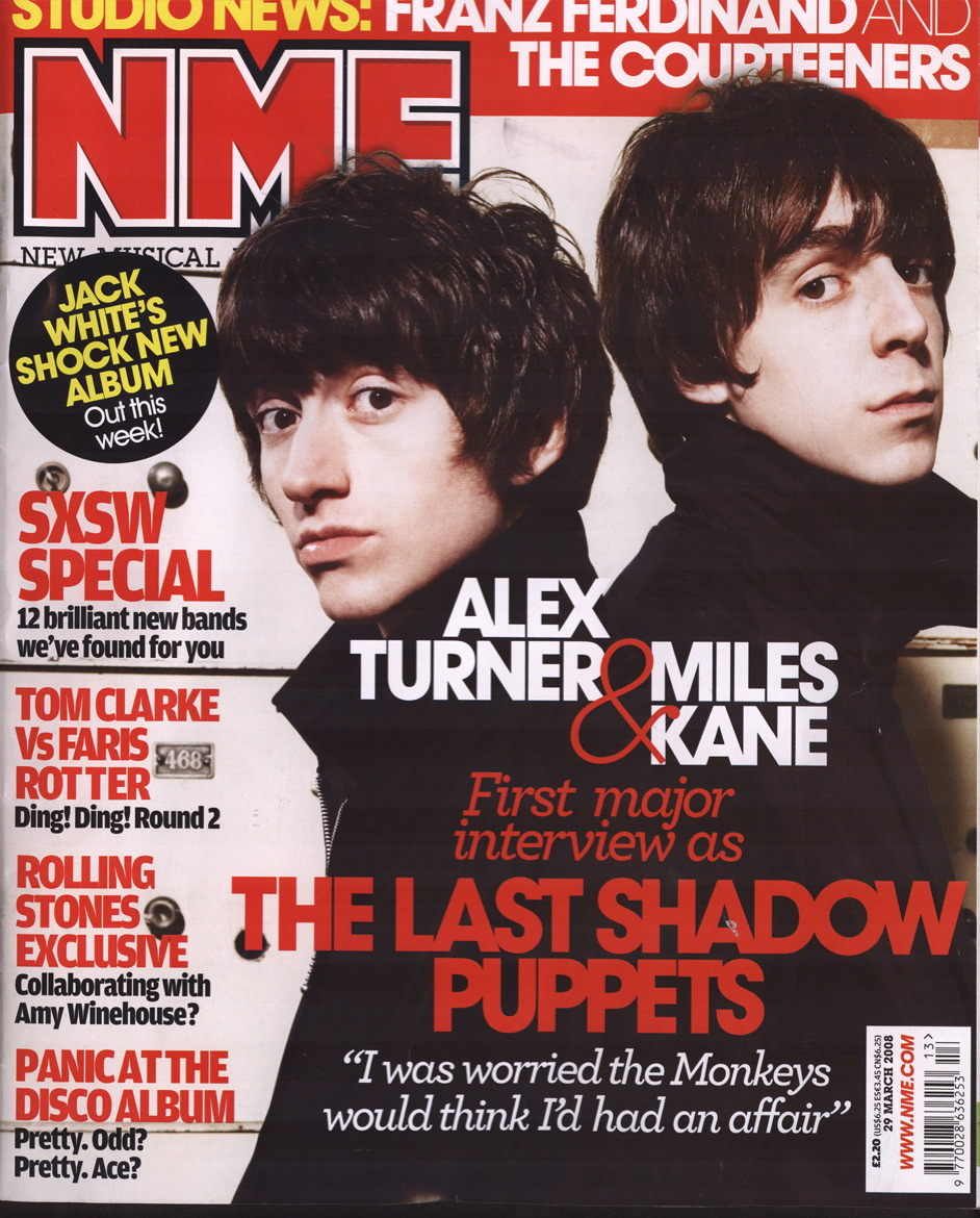
This title is similar to the one I'm going to do, I'm choosing a simple title which will stand out on the side with a quirky font. This doesn't stick to the usual conventions of a music magazine where the titles are usually a simple bold font. My main headline isn't going to go across the whole page because I don't want to over power the picture with such a bold headline. I could have my title as Solo Music Distribution but I think it would look better if I just had SMD on the cover, with the full name underneath in a small font, which is similar to NME where they have New Musical Express underneath. Most magazines don't change the colour of the title unless there is a special edition, however my magazine is going to change the colour depending on the colour scheme used in each front cover. For example it wouldn't look good if it was pink (lets say) all the time and the model had clashing colours on and were male.


Questionnaire Analysis

This is my music questionnaire analysis, the data is collected from my questionnaire which I handed out to people who were my target audience. This way I would only collect data suitable for my music product. 
I'm actually going to call my music product "SMD" - solo music distribution and specialise in solo artists in the indie genre because I feel sometimes they don't get enough recognition by larger magazine companies,  but they don't put them on the cover because they only want established artists to be on their covers. 
I'm actually going to use a purple theme for my magazine because it relates to my artist who is going to be female, although this wasn't in the questionnaire and it's not in my feedback, it still suits the codes and conventions of the magazine therefore it will still work.


1.       What would you call a new music magazine aimed at people with an interest in pop/indie music?
Chordal, SMD, C.D collection, Music Madness, Skinny Jeans, Music! Pop Music Magazine.
2.       What colour scheme would you like to see throughout the magazine?

3 Red, black, and white     7 blue, grey, and white  0 red, yellow and orange

3.       What style of article would you like to read? E.g. formal or informal
8 informal 2 formal

4.       Would you like the magazine to be glossy or non glossy?
3 non-glossy  7 glossy

5.       What type of articles attract your attention?
Football, and bad things about celebs.
Funny ones
Reviews
Band profiles
Articles on fashion, new music and new films
Interviews and reviews
Music reviews and gigs
Informative
Humorous
Reviews on really good bands


6.       Do you read the editorial? If not what would make you read it?
No, lots of images
No, if it was interesting
No, something personal
Yes, humour
No, nothing
No I wouldnt ever
No, nothing would                                                                                                                                  
No idea what it is
No, I dont know what it is
Yes.
7.       What types of image would you like to see in the magazine? E.g. full page, thumbnails etc
  Half page, text surrounding images
Full page
Half page
Full page, thumbnails
Full page, thumbnails, filmstrips
Full page
Full page images
Full page
Full page

8.       What style or font would you prefer the mast head like to be?
Bold and Big
Clear
Big, catches your eye
Smart. Easy-to-read, but not boring
Something frivolous
Clear, large, bold
Clear font large
Times? Bold
Big bold straight edge

9.       How often would you like it to be produced?
Once a week
Weekly
Once a month
Monthly
Monthly
Every other week
Fortnightly
Every month
Weekly
Weekly

10.   Would you like promotional offers and freebies to be featured? If yes please specify.
Offers for places such as HMV
Vouchers, well known high street shops and posters
Yes, tickets discounts and free band t shirts and mugs
Yes giftcards
Demo C.D.
Yes, promotional offer, freebies, notebooks, pens, earphones
Yes, t-shirts
Yes, free C.D. t-shirts, flip flops
Yes, free iTunes voucher
Yes, gig tickets discounts
11.   What sort of adverts would you like to see in the magazine?
T.V. and music related
Cool ones.
Adverts for new films, albums
Nice looking men, clothes
Hot men in bands and clothes
Charity ads
Television series or films
Television or music
About upcoming gigs and concerts
Upcoming concerts and music events

12.   Would you like other aspects of the media such as the internet or television to be included in the magazines content?
Yes.
No
T.V. maybe, internet no, other no
Yes
Yeah
T.V. programmes
Yes
Yes
No
Depends how
yes

13.   Can you give 3 key words you would expect to see on the cover of an indie/pop based music magazine?
New, cool
Rad, music!
Music, indie, pop
New, album, band
Images, articles,
Music, guitar,listen
Original HIP, Justin beiber
I dont know
Bands, charts, singles
Indie = Florence and the machine, music fringes
Pop = Justin Beiber, JLS, wow.

14.   What style of article would you like to see? E.g. reviews, interviews or gossip.
Interviews or reviews
Reviews and gossip
Reviews, interviews, stories
Reviews, interviews
Reviews interviews
Reviews
Interviews, reviews
Interviews
Gossip, informal interviews
Reviews and interviews and gossip

Wednesday, 17 November 2010

Questionnaire


This is my questionnaire for my music magazine. By doing a questionnaire and handing it out to my target audience I can clearly see how I should layout and style my magazine. I can also include content they would like to read. I've also asked about promotional offers and freebies because I want to know exactly how to attract the right person to my magazine. It's not about creating a magazine and then finding the audience, I'm trying to make it to suit their wants and needs in a music magazine. 

Music Magazine Audience Questionnaire
1.       What would you call a new music magazine aimed at people with an interest in pop/indie music?

2.       What colour scheme would you like to see throughout the magazine?

o Red, black, and white    o blue, grey, and white  o red, yellow and orange

3.       What style of article would you like to read? E.g. formal or informal

4.       Would you like the magazine to be glossy or non glossy?

5.       What type of articles attract your attention?

6.       Do you read the editorial? If not what would make you read it? 

7.       What types of image would you like to see in the magazine? E.g. full page, thumbnails etc

8.       What style or font would you prefer the mast head like to be? 

9.       How often would you like it to be produced?

10.   Would you like promotional offers and freebies to be featured? If yes please specify. 

11.   What sort of adverts would you like to see in the magazine?

12.   Would you like other aspects of the media such as the internet or television to be included in the magazines content?

13.   Can you give 3 key words you would expect to see on the cover of an indie/pop based music magazine?

14.   What style of article would you like to see? E.g. reviews, interviews or gossip.

Tuesday, 9 November 2010

Preliminary Task Final

 This is my final draft for my preliminary task, as you can see it fits the codes and conventions of a school magazine. 


  • It has a blue colour scheme which matches the school uniform of navy blue.
  • A catchy masthead about A*s which is all about achievement. 
  • Several sell lines which are related to school and how students can get some tips for their homework.
  • Some very smiley models who're holding up signs that spell out the schools initials Folkestone School for Girls. 


But if I had the chance to do it again I would:
  •  Include more sell lines because it does look a little empty.
  • I would keep the models I've used but change the location because the light makes the image look different. 
  • I would also edit the image to make it lighter or darker. 
  • I would use a different font on my masthead and include a variety in my sell lines because magazines always have different fonts. 
  • I might use more academic props such as books and I may add pictures to the front which could be viewed inside.
Here I've included some of my feedback from class members:
Peer Evaluation of College Magazine Front cover

Front Cover                                                       
  • Does the front cover engage the reader’s interest immediately – if ‘yes’, why do you think this is. If ‘no’, write 3 suggestions to improve this quality?
(i) Yes, eye catching masthead
(ii) More than 1 person in main image
(iii)Interesting layout (stars, and “see more inside”)
  • What do the sell lines reveal about the potential reader?
That they are keen to be successful (helpful homework hints) and may be interested in extra curricular activities (band practise)
  • Who do you think this magazine is targeting and how can you tell?
Younger years due to homework hints and band practise
  • What does the representation in the image and/or in the language tell us about the potential reader?
That they like fun as the models are smiling
  • Offer one comment about the use of image. It can be either positive (although remember that your aim is to help the publisher improve) or constructive.
(i) Unique picture which interests the reader.

  • Offer one comment about the use of language. It can be either positive (although remember that your aim is to help the publisher improve) or constructive.
(i) language is engaging, but there could be more of it.

By Adele Tyrer 


Peer Evaluation of College Magazine Front cover

Front Cover                                                                     
  • Does the front cover engage the reader’s interest immediately – if ‘yes’, why do you think this is. If ‘no’, write 3 suggestions to improve this quality?
(i)The bright blue colour of the heading stands out and is eye-catching
(ii) The image is quite bright so also sticks out
(iii) A really clear layout so is easy to read
  • What do the sell lines reveal about the potential reader?

They are quite musical but also get some work done. Also that they are quite musical.

  • Who do you think this magazine is targeting and how can you tell?

I think the magazine is targeting around KS3 and above as the image is of sixth formers and the magazine is giving help with homework.

  • What does the representation in the image and/or in the language tell us about the potential reader?

The image shows that the potential reader is happy that they enjoy going to school. The language tells us that they like a bit of gossip and like music.

  • Offer one comment about the use of image. It can be either positive (although remember that your aim is to help the publisher improve) or constructive.

(i)                The image looks a bit stretched

  • Offer one comment about the use of language. It can be either positive (although remember that your aim is to help the publisher improve) or constructive.

(i)      More language used on the front cover

By Hannah Milton

Wednesday, 20 October 2010

Preliminary Task - School or College Magazine


Preliminary task –

This is my preliminary task, where I created a school magazine to be published for my school. Here are the codes and conventions of a school magazine:

  • Bright eye-catching colours


  • Positive sell lines which relate to school

  • Enthusiastic looking models or students

  • A school related colour scheme

  • Here is my initial plan for my school magazine created using Paint, it’s very simple but it shows where my sell lines will be and where the main image will be:


    Welcome to my blog!

    This is my first blog, which I've created for the purposes of keeping a record of my AS level in Media and what I do each lesson. In this blog you will be able to track my progress throughout the making of my music magazine in which I'm going to create the front cover, contents page and a double page spread feature on a band of my choice.

    In preparation to this our class has made a mock  up front cover for a school magazine which I called Written in the Stars! I think that this went quite well because of the research which we did along side the magazine, this involved doing a questionnaire and then acting on the feedback. We will be doing the same for our music magazine, this will be my next blog update


    I've also included the codes and conventions for a music magazine:

    Codes and conventions
    1.       Colour schemes –
    Rock – red, black, white
    Pop – pinks, blues, yellow, orange, bright colours
    Classical – mellow colours, pale blues, creams, greens
    2.       Formal written text
    3.       Lots of different fonts for different features
    4.       Variety of images  - big, small, black and white, full colour
    5.       Bold headlines and use of colour to attract target audience
    6.       Interviews, first hand, articles, quotations
    7.       Page numbers – contents page, may use images from front cover to link the contents page up - visual recognition.